How to choose the right colour.

Define: the mood and goal of your project
Choose: the colour you feel best captures and expresses this mood
Experiment: with different possibilities
Refine: your colour options down
Please keep in mind:
If it doesn’t work in black and white it will never work.
Colour will never make up for a bad design.
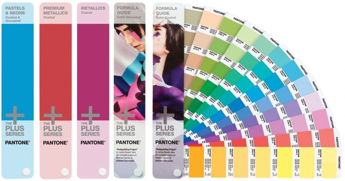
Universally designated number system.

The process of color selection should never be an after-thought.
Color’s immediacy means it is pivotal to creating a successful design strategy, and its innate ability to differentiate and connect brands to consumers make it critical to success.
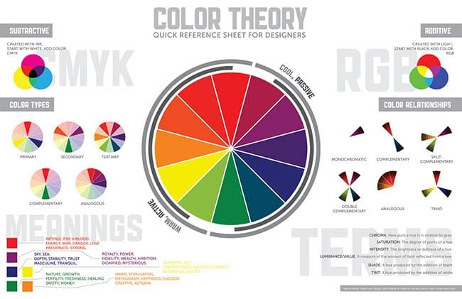
There is a science and emotion of color to provide a unique and comprehensive set of solutions for every step in the process of choosing and realizing your color.

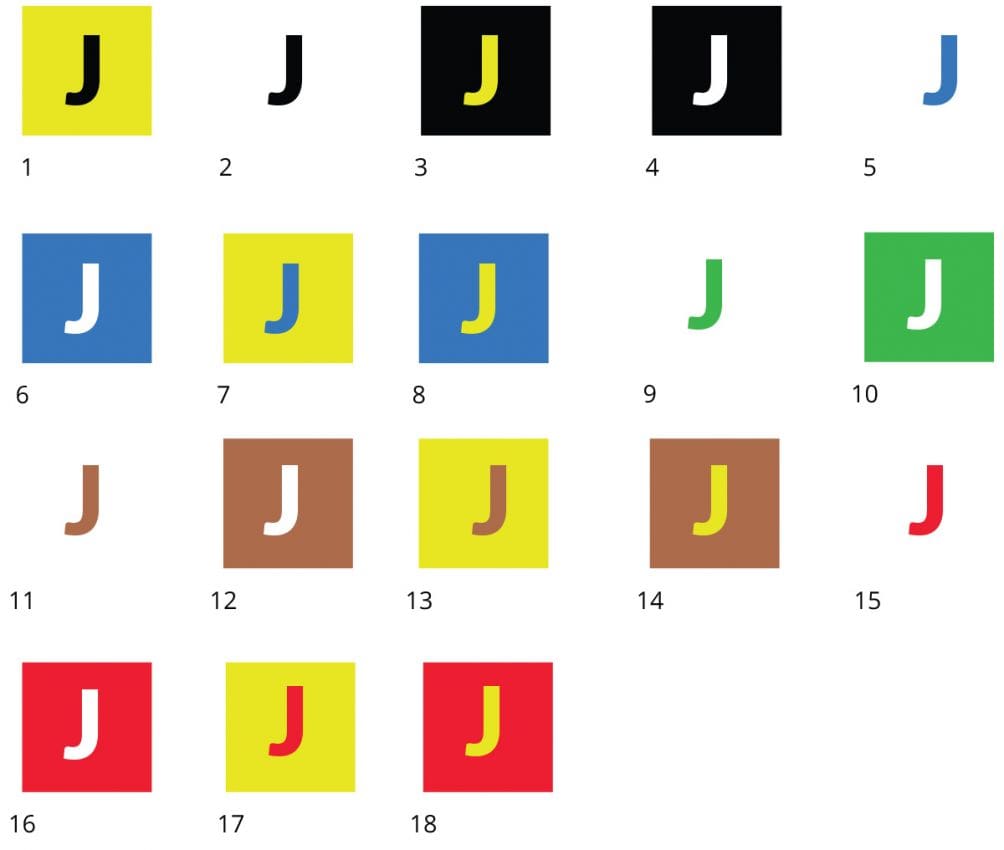
Comparative visibility of full value colour combinations.
These 18 colour combinations for lettering, using only primary and secondary colors of full hue and value, were tested for readability at a distance.
Results averaged out in the sequence shown, with #1 being the most readable.


The background colour of a sign is important. Do you want the sign to blend in ( be camouflaged ) with only the lettering to be the focus or do you want the existence of the sign to be prominent and thus bringing your eyes to the board first and then the message.
